The following 7 design, inspiration and other bits of interest bullets that kept me pondering during last month:
- I only ever posted just one shot on Dribbble. It was of a real product to be mockups, rather than no constraints inspirational play. It received some love, but not as much as expected. Why? This article ‘the unbearable lightness of dribbble‘ sums it up pretty well: http://bit.ly/dribbble-and-ux
- If you’re as big into movies as I am, then you’ll appreciate this list of 20 documentaries for designers. http://bit.ly/docs-for-ux My personal favorite (and one of the best movies of all time) that speaks on so many levels is Life in a day movie/project. It’s made of hundreds of simple youtube videos covering the cycle of a single day across the globe. While it might sound ‘meh’, it tells a truly profound story.
- Everything is contextual and relative. Especially time. Imagine if your service user is used to waiting for 3 seconds for something to load. For whatever reason adding an extra 1 second would make that time 4 seconds – just 33% more of an initial value. The users probably wouldn’t even notice. Now imagine if your user is used to wait just 1 second and your service slows down to an additional 1 second of wait time. This even if a minor increase is a flipping 100% rise or doubles in time waited. Same applies to everything else in our lives. Our age, for example, is unique to us and relative to all the time we experienced in the past. This article with a handful of visualizations tells it better than I could: http://bit.ly/time-visualisation
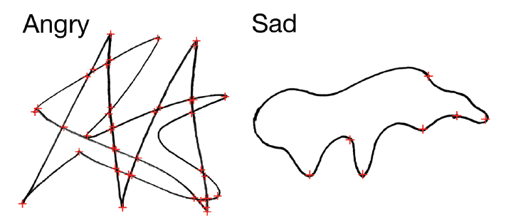
- This month’s random interesting psychology study which can be directly applied in visual means is about how we associate different shapes with different emotions. It’s clear that low-level physical features of shapes, speech, colours and movements influence emotion judgements:

It works the other way around too. For example, you couldn’t imagine death metal band logo bot being spiky jagged scribble (sorry dm fans), or poetry book not illustrated with floral scenery. What’s clear is expressions of emotions are universally understood across cultures and species (!) because they are signalled using a multi-sensory code. Definitely worth exploring: http://bit.ly/shapes-psych-study
- The simplest of frameworks are the ones that pro designers actually adopt and use. So here’s one of them about the Design systems and its maturity level. Which one of these is your organization or product team at? Most importantly, what can you do to take it to the next level? http://bit.ly/designsystem-maturity
- When I first read this headline I thought it would bash the annoying new preview card feature on Netflix TV app. Instead, it’s really about the addictive Netflix content strategy and UX design that does keep us up at night: http://bit.ly/Netflix-UX
- And lastly, something from yours truly… I just had a very insightful evening UX chat with one of my favourite design thinkers, Microsoft UX architect, billboard design thinking method evangelist Sean McGuire. In a video podcast style, we had an amazing discussion on best practices when it comes to UX workshop facilitation, tips to dealing with difficult stakeholders and some cautionary tales. The whole interview is almost an hour, however, you can also find short highlight videos in this YT playlist: http://bit.ly/UXchat-DesignThinking
Like what you see?
Get a monthly email with 7 design bullets. The things that kept me pondering over the last month that I think can benefit you. For example, you can expect a mix of:
- Design inspiration
- Emerging and disruptive tech
- Experience design ‘stuff’: UX, CX, service and product design how to’s, case studies and best practices
- Design ops, process improvements and better ways to work together
- Controversial topics and design challenging takes
- Random interesting psychology studies
- My UX resources I think would benefit you
+ a few concise thoughts on all of the above.
Ready to opt-in?
- Comes out once a month
- Absolutely free
- Spam-free
- Unsubscribe anytime
