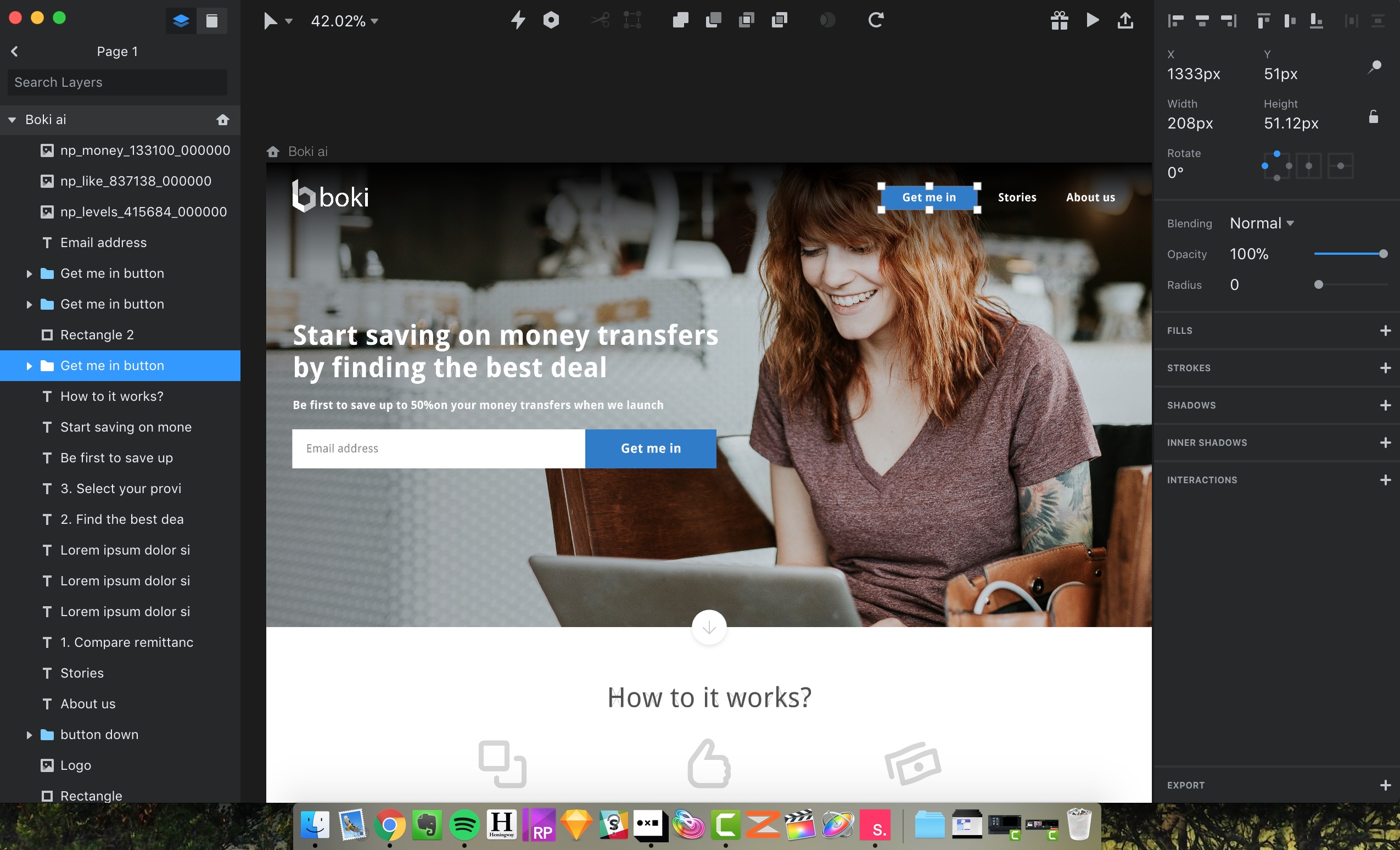
The other day I got a request to deconstruct and review a marketing site (just UI design) for an early stage startup: boki.ai.
Its founder wants to understand if their product has market fit by asking people to sign up to get informed when the product launches. Yet, there are a few issues regarding their content and UX strategy they should address first:
It’s easy to just identify the improvement areas. On the other hand actually proposing tangible changes is what it takes for change to happen.
I decided to spend just 1 hour trying to improve areas I highlighted before:
Such design facelift is a small big upgrade to pre-launch product/service. The founder was impressed by what could be achieved in just 1 hour of product design work. In particular, how much stronger and more relatable the story got by simple use of photography and UX copy tweaks.
