In this video, I’ll answer a couple of very specific UX portfolio questions from one of the viewers. In particular, how deep should you go with your UX case studies?
Often designers get stuck on how much detail they need to add to make their work look cohesive and engaging for the hiring managers. This is exactly what we’ll cover: what you need to focus on and how to add necessary depth without drowning the reviewer in minutia that they don’t really need to see.
I recently also created a playlist that contains all my videos on UX portfolios here.
***
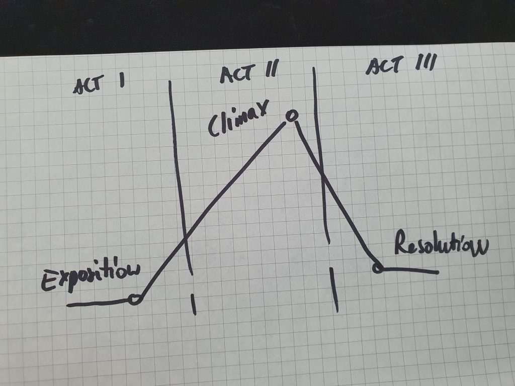
Note, the infographic at the 3:14 minute mark is misrendered. The actual story arc should look like this:

