How can designers expect businesses to care about “dark patterns” when the terminology is so vague?
I
California’s regulation for dark patterns is not the solution
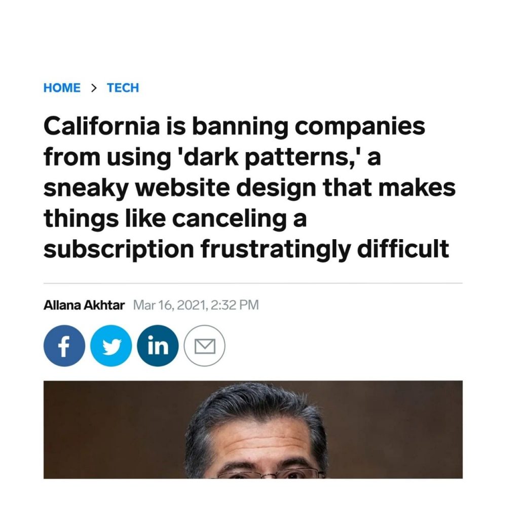
Finally, some great recent news for the UX community: California to pass a regulation to control the so-called dark patterns. Yet, the more I thought about it and read into it, the more I realised that it’s not that big of a deal.

All the regulation strives to do is provide the users with the ability to opt-out from their private information being sold to third parties. Of course, it’s a big deal as there were very few developments on appropriate legislation regarding the tech products, but it’s not the solution we’ve been waiting for.
Although, what still excites me about this is that this regulation can be used as kindling for better things to come. Not just within the original state, national, but also international contexts. Meanwhile, if you’re interested in the actual consumer privacy act, make sure to check the official ca.gov documents here.
II
Very specific yet open-ended
Dark patterns were defined in 2010 by Harry Brignull, PnD as:
“A user interface that has been carefully crafted to trick users into doing things, such as buying insurance with their purchase or signing up for recurring bills.”
Over a decade later, this is still used as a standard definition for all manipulative patterns in tech.
III
But how dark are your patterns?
Dark patterns is one of those blanket labels that lazy designers and technologists love to throw around to signal some pseudo-ethical virtues.
But the real issue I find with it is that the dark patterns have been left in their infancy without any formalisation or specificity. For example, how dark (and thus severe) are we talking. Labelling random things as light vs dark is akin to calling something good vs evil. And while the intent might be good, the language and specificity matter much more. Especially if we genuinely seek change.
Meanwhile, the vague dark patterns statement could mean a lot of things. Casually browsing Linkedin over a couple of weeks, I collected just some of the dark patterns examples:
- Perceivably unethical* business-first decisions that impact its customers negatively?
- The persuasive design used for business purposes?
- Purposefully small close buttons on ads?
- Tiny text that is too tiny for anyone to read the implications?
- Copy that guilt trips you to act?
- Shareholder value over user value?
- The element that misdirects or guides you to act on things that you might not otherwise?
- Modal that tries to capture your email address at any cost?
- Service that doesn’t allow you to opt-out through the same channels you opted in. And do so quickly?
- All the hidden terms, options or costs?
- An upsell?
- Service that disregards your privacy and sells your data to other parties?
- Service that intrudes and uses your friends’ network for its benefit
- Service that tracks your every move and manipulates you into buying things?
- Service that tracks your every activity to manipulate the political landscape and, as a result, your livelihood?
- Unregulated service and in practice runs the world as we know it?
…
All of the above? and as a result, none of the above?
*Ethics aren’t universal**. On the other hand, underlying human values have been documented to be shared across different cultures, contexts, geographical locations, among many other variables that usually affect the spectrum of what we perceive to be either good or evil: http://bit.ly/humanvaluesstudy
** Universals and variations in moral decisions made in 42 countries by 70,000 participants:http://bit.ly/ethicsnotunivers…
IV
The importance of language
I’ve shared a few resources and studies on how important language is for our senses, emotions, and behaviours. Several studies that come to mind*** that perfectly describes this is the one about how cultures that have distinctly different origins to their languages struggle to align on the emotional and sensual spectrum.
Some cultures have no words to describe a distinct taste, sense, and emotional response, and thus it gets bunched with other senses, or new terms have to be born. However, given that dark patterns in all, its vagueness is expressed primarily in English but used globally can only result in misinterpretation.
Remember, if our goal is the change, what could be a better term that would have actual weight and be perceivable by different cultures? And by cultures, I don’t just mean geography, regions, belief systems. Let’s take an example of user-centred specialists vs business stakeholders, where UX represents user needs, and the business represents the bottom line. Communication via appropriate lingo is what connects the two.
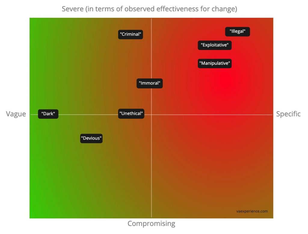
In the past, when encountering ‘dark patterns’ or otherwise exploitative ways of delivering user experiences, I’ve used several different terms to add importance to these elements. Sometimes forcing the attention on items that need to be addressed, often by people who might not care (why would the language we use is a vague naivete sprinkled “dark patterns”?). Most of these can be expressed on the following matrix:

Note this distribution is the result of N=3 mapping, and therefore would definitely be worth its own appropriate research study.
*** Emotion semantics show both cultural variation and universal structure: https://science.sciencemag.org…
*** Odors are expressible in language, as long as you speak the right language: https://pubmed.ncbi.nlm.nih.go…
V
Enter the outright manipulative patterns
Why did I pick “manipulative” as a working label? Talking about previously noted severity and specificity that is required to achieve change, it was an option that seemed to represent and anecdotally work to describe the wrong choices for business stakeholders.
For full disclosure, I used “criminal” just the other week. But alongside “illegal”, “exploitative”, “immoral”, and “unethical”, these words were either too out of reach or too vague to drive the message. Again, this is a N=3 take and is oriented to spark discussions, not drive conclusions.
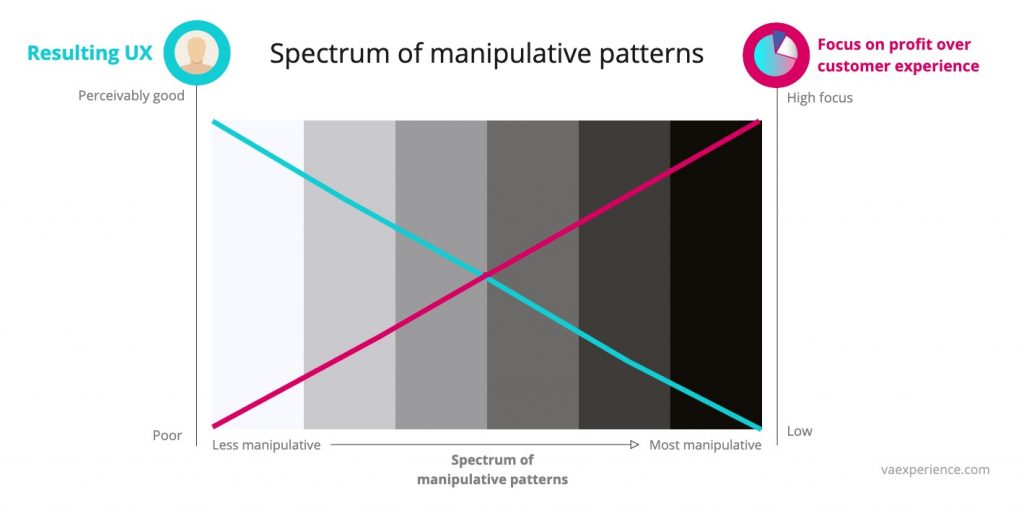
Regardless, manipulative describes the “dark patterns” and tells a better story. Mapping my thoughts on a few posts-its, it would look something like this:

The business bottom line always drives customer (user) experience manipulation (usually for worse). As a result, customers involuntarily perform an action that can be perceived at the time of the experience or in hindsight. The resulting sense of unfairness alongside other factors sink the experience even further. In most predictable cases, customers find a better option to receive the services; in the worst cases, you get the worst of the previously listed ‘dark pattern’ examples. So the vicious cycle starts again.
VI
The spectrum of manipulative patterns
Ultimately the point of these explorations is not to rename the terms. Like with good vs evil, light vs dark, the accurate placement can happen with a predefined spectrum: how dark are your patterns?

The sole drive to improve the bottom line run in isolation is antithetical to good user experiences for the customers. More often than not, resulting in poor manipulative and exploitative experiences, and in the current attention and infinity choice economy leads to unhappy customers and underperforming businesses.
If designers keep hiding behind the vague terminology the manipulative can soon become exploitative.
