The following 7 design, inspiration and other bits of interest bullets that kept me pondering during last month:
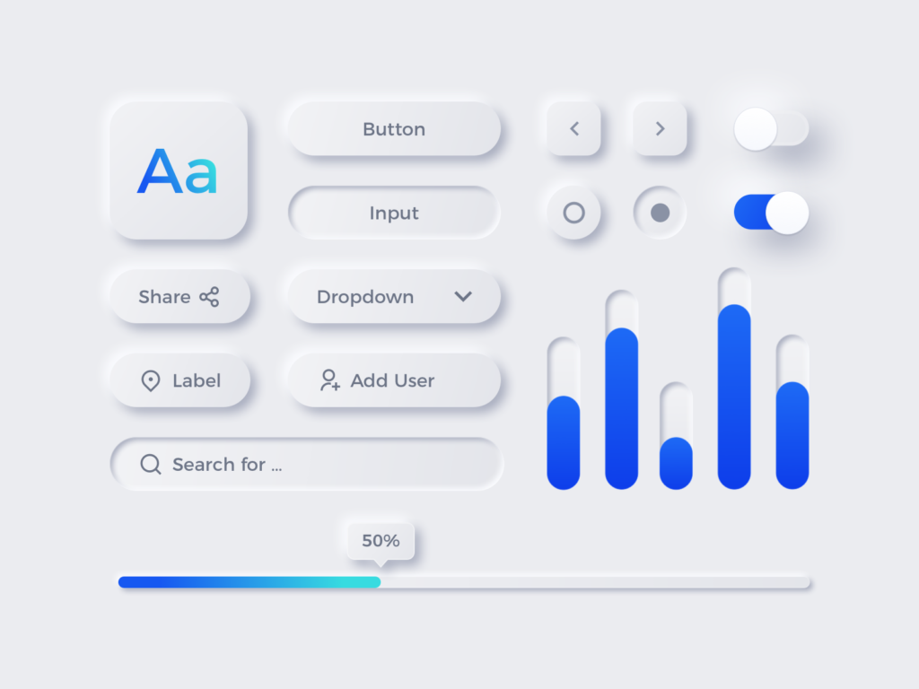
- While designers still struggle to understand the difference between trends and fads, I do like this new wave of style (which I would still consider a fad to pass within a year or two) labelled Neumorphism. While I think Flat design generally sucks and Skeuomorphism is too outdated, the newly born Neumorphism doesn’t seem like a good enough answer. It does look good though. You probably have seen a couple of these Dribbbles with super soft smooth shadows, oversimplified layouts (the pitfall of Neumorphism), flat but lifted components etc.
Here’s an example:

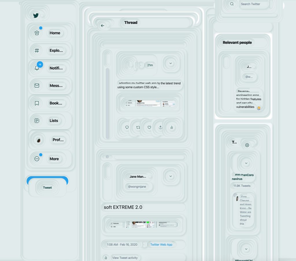
Does look good as a sheet of components, but what if it would be implemented? Would it be usable? Some designers gave it a go:

Credit: @wongmjane, Twitter
- On the related note, if you do fancy the above look and feel and want to get inspired or simply give a go to implement this new style, this generator is a superb starting point. Within seconds you can generate super smooth shadows and get the CSS needed to code it. Of course for regular designers this is also a perfect sandbox to learn the key ingredients to making Neomorphic details: http://bit.ly/neumorphism-css
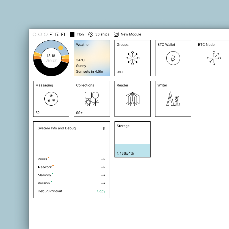
- Now that we are aligned on what Neomorphic design is, let’s check this super cool Urbit operating system with a completely different take on modern GUI. Urbit OS is a clean slate system (it also looks like it). You can read more about it here: http://bit.ly/urbitos but the screenshot should tell a better story (of at least 1000 words):

What do you think? Send a note – I do want to hear your thoughts.
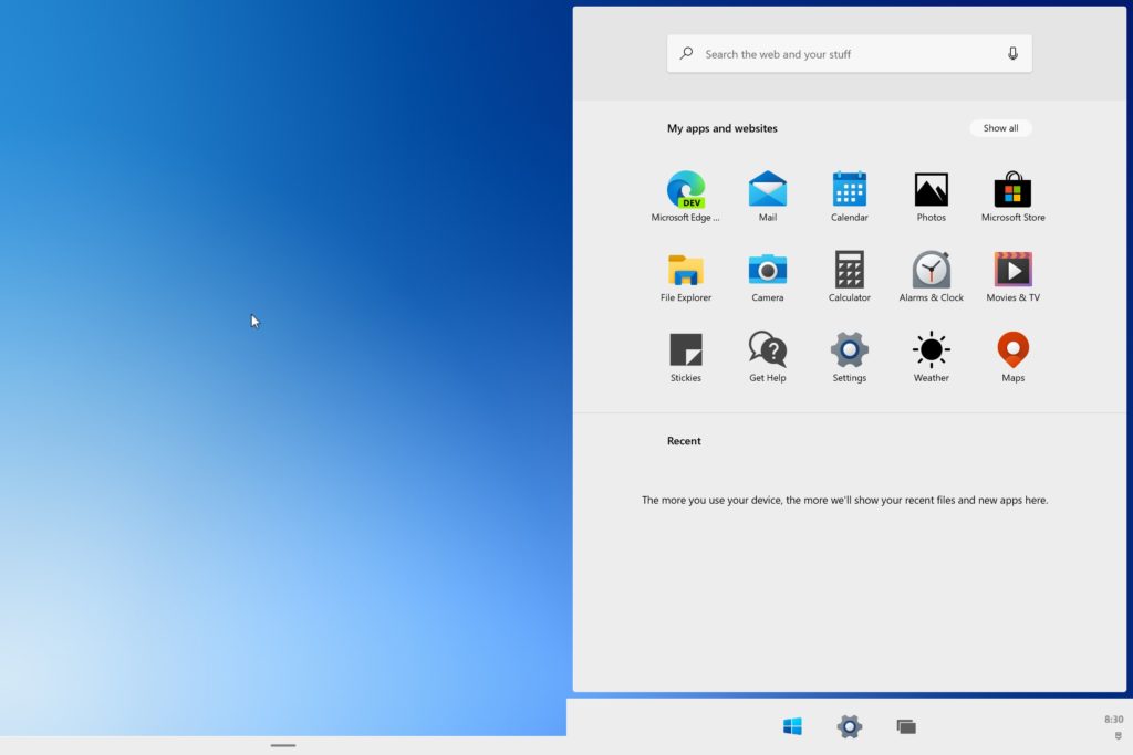
- Talking operating systems, there has been a few preview leaks of the new Windows 10x – and it looks like a big upgrade to come. This summary by @migualdeicaza on Twitter makes it super clear: “Windows 10X is a bigger deal than people realise so far: it is bitrot proof, clean redesign of Windows. Like iOS is to macOS. It runs traditional apps inside a container and won’t let apps that hooked or poked the OS in unsavoury ways run.” Sounds like Windows will finally reach a close to or even playfield with Mac OSX. Whilst the initial previews are for the dual-screen experiences, it’s clear that the same features will bleed into typical desktop Windows OS:

- This month’s random interesting psychology study covers partially the design ethics of new social media services, and partially the fear of missing out (FOMO) that such services are notorious for. Specifically for you fellow designer, the study is a treasure trove as it highlights feature suggestions to reduce FOMO for the users: reducing number of notifications, ability to show that a person is unlikely to respond and many more. Worth a check: http://bit.ly/fomo-psych-study
- More often than not I stay away from interpreted media that recycles historical snapshots and quotes from selected few individuals. One of those icons is Steve Jobs and his legacy to making magic things reality. This article on graceful hustle does resonate with my own journey to becoming a UX designer. If you need a few words of encouragement to get out there and get after it, this just might be it: http://bit.ly/steve-jobs-1-thing
- Lastly, I had an on-going (and quite unhealthy) relationship with Adobe Creative Cloud suite of products. Over the last decade or so I dropped to using just 1-2 apps. Using them only every once in a while. And so this year I called it quits. Perhaps this is something you’re considering yourself, or maybe you like Adobe CC so much that it might invigorate the love further. Either way might be worth a watch. (P.S. I spent way too much time editing the intro): https://youtu.be/bEN3_C_ym5Y
Like what you see?
Get a monthly email with 7 design bullets. The things that kept me pondering over the last month that I think can benefit you. For example, you can expect a mix of:
- Design inspiration
- Emerging and disruptive tech
- Experience design ‘stuff’: UX, CX, service and product design how to’s, case studies and best practices
- Design ops, process improvements and better ways to work together
- Controversial topics and design challenging takes
- Random interesting psychology studies
- My UX resources I think would benefit you
+ a few concise thoughts on all of the above.
Ready to opt-in?
- Comes out once a month
- Absolutely free
- Spam-free
- Unsubscribe anytime
