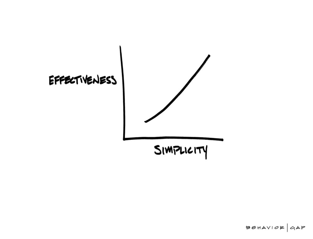
Every decision you’ll make will land on a spectrum between 1) simple (effective) but hard to achieve, and 2) easy in the short term but awful in the long term.
As humans, we naturally default to immediate remediation actions because they are easy, but they rarely result in decent outcomes. Fact is, simple and effective takes courage, commitment to do the hard work and make difficult decisions as you go. This month’s newsletter is about the choices we as designers make.
- This next example of how taking an easy route is never the right thing to do is from Kristy Viers – a visually impaired iPhone user. Take a look at this demo of Kristy using her phone:
https://twitter.com/Kristy_Viers/status/1287189581926981634
Now, if Apple designers would have taken the easy route to simplify complex scenarios, then they would end up tweaking colour contrast and maybe optimising the screen reader here and there. But they care more about their users. As a result, a lot of designers were blown away how sophisticated and intuitive the accessibility on the iOS device is for this blind person use case. All Apple designers and tech team did was focus on delivering simplicity, even if it meant years of continuous hard work. - If simplicity is the ultimate goal for any designer, then taking easy, immediate actions won’t cut it. This month’s random psychology study is precisely about how a strategic mindset and making hard decisions is paramount in any goal pursuit. Being strategic on more levels than just one is extremely hard to do, but it’s necessary:
https://www.pnas.org/content/117/25/14066 - All immediate answers and ideas are OUTDATED*. It’s all those things we think we know so well that we don’t need any other insights to draw fast (always easy, rarely simple) conclusions. It’s much harder to pause, spend time and consider all the things involved to refresh what we think we know and make much more informed decisions.
*I borrowed this notion of all immediate ideas, gut feel, answers and the solutions being outdated from Derek Siver’s new book Hell Yeah or No, a highly recommended book to read for designers: https://sive.rs/n - For a very long time, I was thinking of what would be the best way to illustrate all this without defaulting to mere UI examples. But what could be a better example for shortsighted easy decisions than the UX design antithesis – brutalist design? It’s a non-conformist design style and movement that many designers adore. But in the grand scheme of things represents a compilation of quite comical, impulsive and as a result easy design decisions:
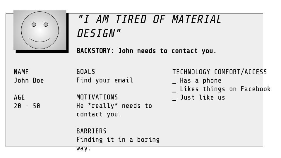
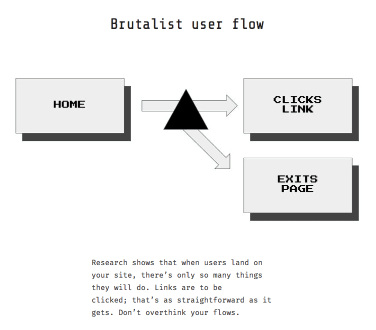
Sadly the above examples are what drives 99% of digital solutions. It’s just… easy.
- Almost a decade ago I bookmarked this gem by Seth Godin titled Easy vs do-able vs Impossible. He states that “often we consider an opportunity based on how easy it is. The problem with this analysis is that if it’s easy, it’s often not worth doing… Successful organisations seek out the do-able”. Do-able here is the simple, the effective. If you genuinely want to be successful, focus on making the do-able happen. Most importantly, ignore the easy.
https://seths.blog/2011/07/easy-vs-do-able/ - From a business perspective, what we do as designers is never deemed as an easy option. It’s counterintuitive, costly, hardly tangible and lacks ROI. Yet still, everyone knows that without design and user research it’s practically impossible to make the project a success. Gladly from time to time, we get a critical design value rundown by the likes of McKinsey consulting. Their researchers took the hard path by spending countless hours pulling this data together so that designers like you and I wouldn’t have to. If you ever run into the issue of justifying design, use this rundown as a tool to convince the business to reconsider:
https://www.mckinsey.com/business-functions/mckinsey-design/our-insights/the-business-value-of-design - If after reading the points above, you’re still left with the aftertaste of the ‘so what?’, then let me share a simple yet powerful ritual that will aid how you approach your design efforts. While I don’t do much of the hands-on design work anymore. When it comes to anything even remotely tangible, I make sure to include an additional set of eyes within an hour of whatever production effort. It’s a drastically different take on productivity and design craft which historically was practised with ‘ready when it’s ready’ mentality. I’d like to invite you to commit to the following manifest to ensure real collaborative work and timely feedback capture:
https://www.onepageonehour.com/
An open challenge to everyone reading this: Next decision you make go for the simple, not easy.
P.S. If I would have taken the easy route this newsletter wouldn’t exist.
Like what you see?
Get a monthly email with 7 design bullets. The things that kept me pondering over the last month that I think can benefit you. For example, you can expect a mix of:
- Design inspiration
- Emerging and disruptive tech
- Experience design ‘stuff’: UX, CX, service and product design how to’s, case studies and best practices
- Design ops, process improvements and better ways to work together
- Controversial topics and design challenging takes
- Random interesting psychology studies
- My UX resources I think would benefit you
+ a few concise thoughts on all of the above.
Ready to opt-in?
- Comes out once a month
- Absolutely free
- Spam-free
- Unsubscribe anytime
