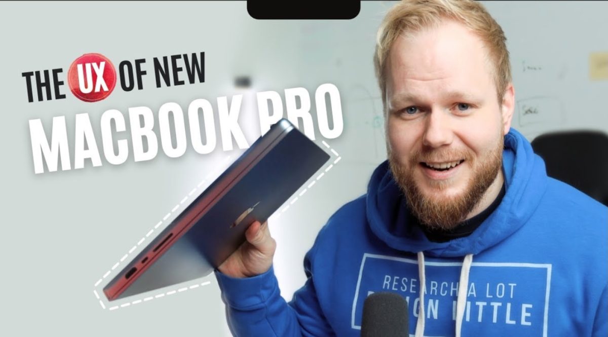
Half a decade later, the new MacBook Pros are made for actual Pros. The majority of the recent changes are taking the product, service and customer experience to the next level (granted most of the features are tried and proven from years ago). In this video, I’ll you through some of the key touchpoints that got me very excited (e.g. hallelujah moment and goodbye to the awful UX Macbook touch bars). Even with a heightened sentiment, there are also a few new developments that got the pros not so happy.
Timestamps:
00:01 Intro: why I upgraded my MacBook Pro
01:06 The UX starts much earlier than product and UI design – Apple’s CX and peripheral touchpoints
01:29 – Macbook Pro M1 Max unboxing
02:33 – Magsafe is back
03:03 – Tactile, visual and auditory feedback
03:42 – Features that Pros missed: Sd card, HMDI and other ports
04:09 – Apple finally is focusing on their actual user needs
04:47 – The new MacBook Pro is thick and heavy
05:31 – Comparing M1 Max with Earlier Macbook Pro gen
06:19 – Goodbye Touch Bar
06:57 – New keyboard that just works
07:32 – Innovation without user research and UX
07:55 – Quick and snappy performance
08:22 – The notch and its UX issues
09:07 – 2 Ways to hide the notch
09:50 – Macbook Pro is made for Pros, finally
The now historic UX bash of Macbook Pro Touch Bar: https://youtu.be/ziXiTxZIIzw
