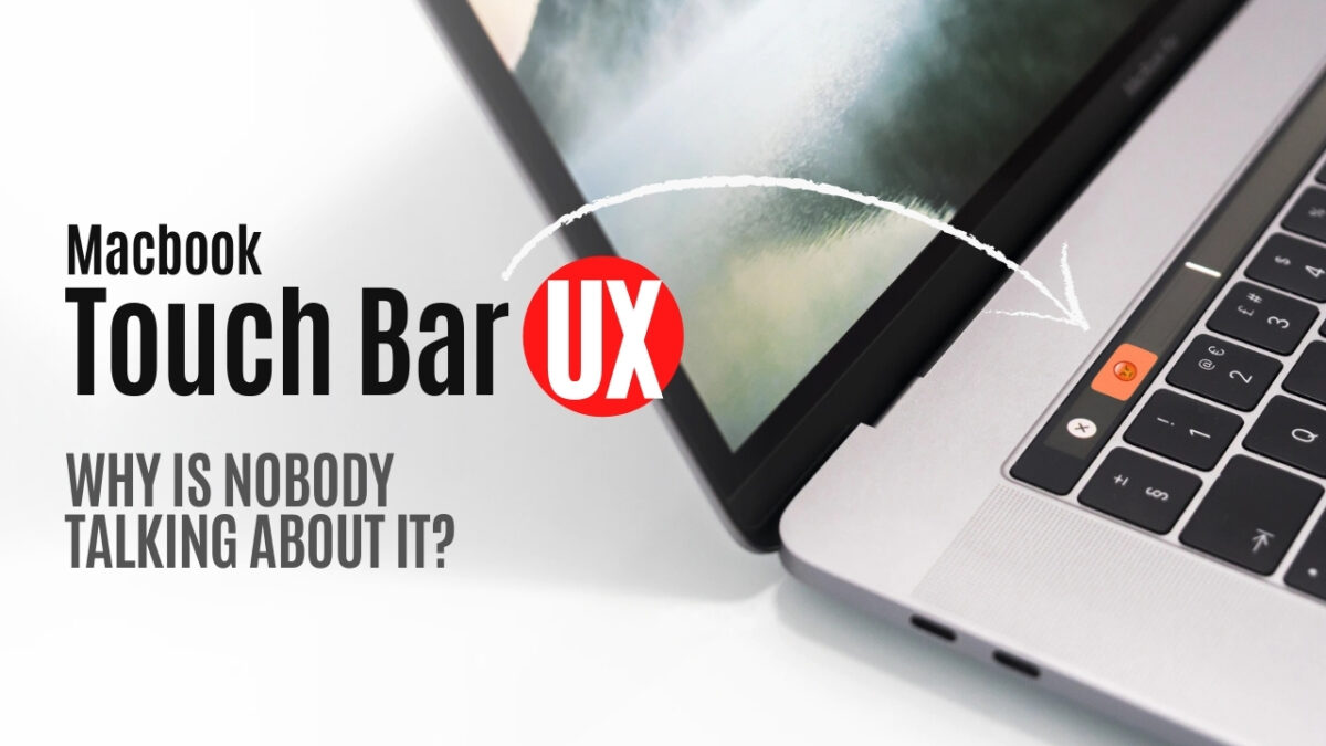
It’s been almost half a decade and there have been very few improvements in terms of Apple’s Macbook Touch Bar UX. With the recent Big Sur release Apple has made some tweaks with repositioning buttons here and there making users relearn to use this input method yet again. In this video, I’ll walk through some of the key concerns, usability issues, and the deal-breakers that make this ‘innovation’ effort questionable. I’ll also share mine as a UX designer and researcher’s take on why Apple was so bold in releasing this untested and questionable (HCI, anyone at Apple???) input method.
Apple’s Macbook Touch Bar UX: Why is Nobody Talking About it?
Categories
