Traditionally, hackathons are labelled as engineering efforts to solve problems in lean teams within a fixed timeframe. Most recently, they have been bastardised by variety of other business streams and sectors. If you look for a hackathon, you will find listings for business rules driven hackathons. As well as workshops without tangible outcomes. There’s also a good amount of “cool” hackathons that really are just meetings. Businesses are trying to adopt new practices, but without a clear goal or activities, the end result looks like this:
In this post I wanted to share thoughts and the first hand experience of participating in hackathons throughout the years. First as a web developer in and most recently as a UX designer. In particular, I’ll cover a case ‘hacking’ a learning management system.
Note that this write-up won’t showcase any outcomes though. Instead I’ll share the key details on how we ran it and how UX help drive the human centred design/development approach. Perhaps you’ll find this useful when considering your future hackathons.
Without further ado, let’s jump right into it.
The setup
- Internal organization effort to enhance learning management system.
- 48h effort with most of the tangible (design, coding) work covered during working hours. True time frame would be close to 15-20h. Give or take.
- Artefacts (optional): whiteboards, post it notes, sharpies, wide format printer, UX toolkit.
The team
- 1 product champion – a person who represents business goals, owns a product etc.
- 3 mixed capability engineers – front-end, full-stack etc.
- 2 UX designers: lead, junior
The process
Time was of the essence. From get go we knew that we will have only a few hours to run a micro discovery and ideation. Strategically, this would have to be just enough to inform actual hacking.

Key activities:
- UX driven discovery, ideation and definition
- Parallel work streams throughout the hackathon duration: UX and product design + Engineering prototyping
UX driven discovery and ideation – 3 hours (with one hour prep before the hackathon)
Note that only engineers and product champion had some experience with the exisiting product. As UX designers we therefore knew that we had to reach common alignment on the key themes. And so running a mini discovery and ideation actities within a handful of hours seemed like the most reasonable approach.
During this time we covered:
- Introductions
Around the table: who are you (name, responsibility), why you’re here (goals). - Qualitative market research and user feedback walkthrough
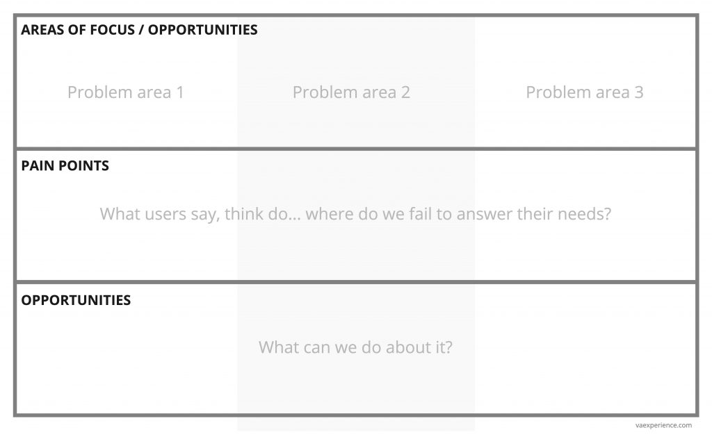
UX facilitated an open discussion on key problem areas using previously conducted research. We mapped 5 key problem areas and captured plenty of pain points and opportunities to improve them. The alignment on these was crucial. - Stimulus activity
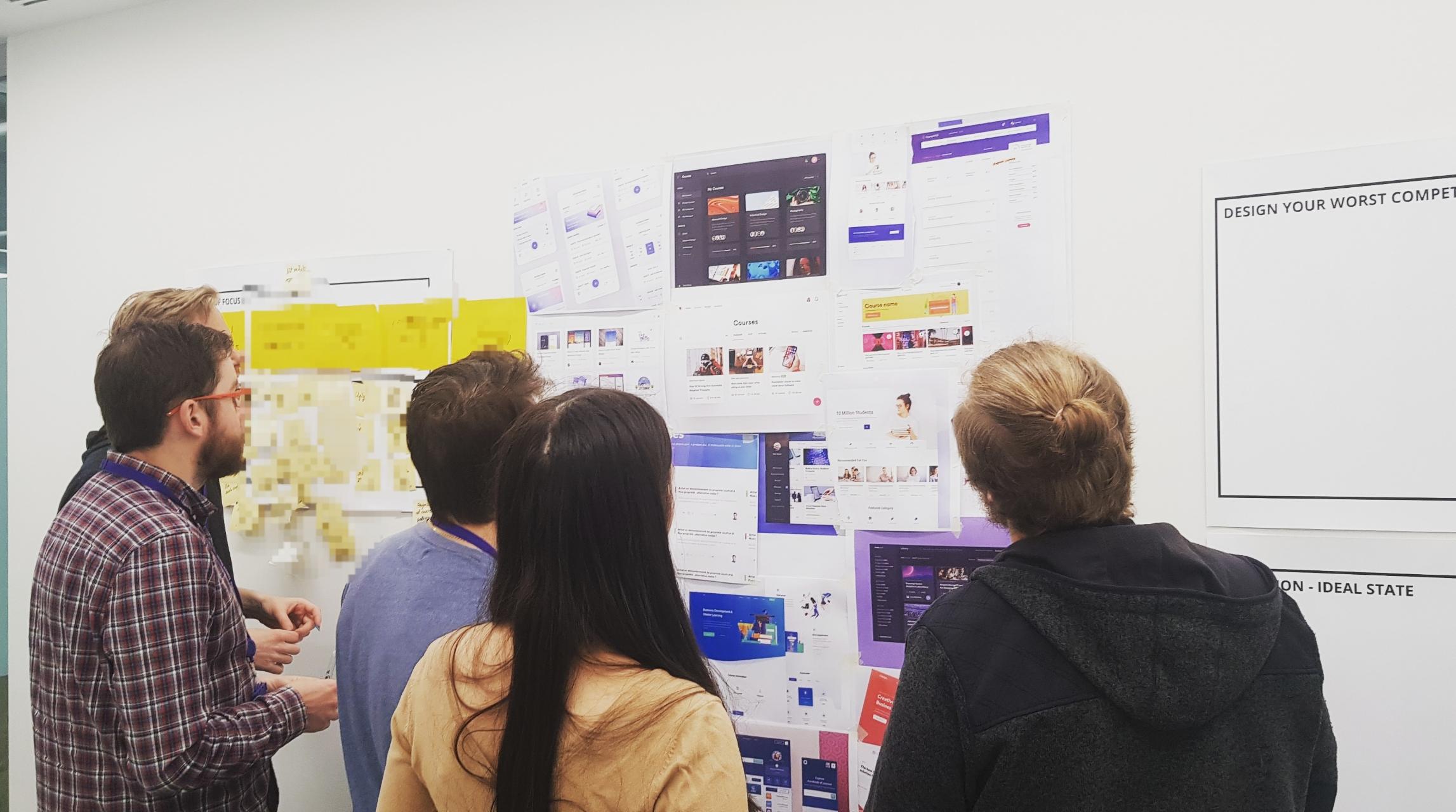
The team went through a handful of great product examples. These included: best practices, competition, gamification, other innovative ways to present content for better learning experience.
To prep. for this session UX before the hackathon to hand picked examples from variety of sources, including: actual competition/products, behance, dribbble. We printed them out and allowed people to have an open coffee/discussion and mark areas that they thought would result in better user experience. The approach sparked new ideas for upcoming ideation efforts.
Stimulus activity pictured:
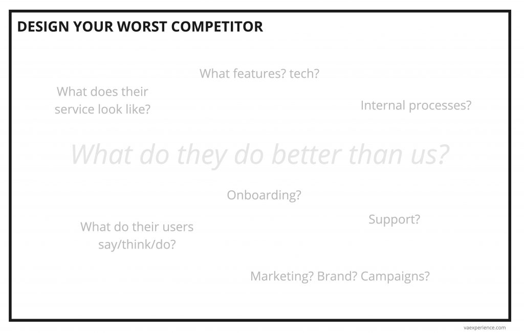
- Ideation: design your worst competitor
Skipped due to lack of time. Usually run as an ideation to forget the current boundaries of the existing systems. This activity allows people to truly innovate and ‘spit out’ ideas that have enough velocity to transform. - Ideation: ideal state
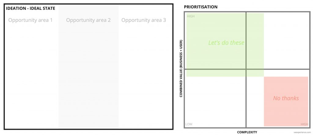
Based on great initial discussions this activity was done as an add-on to stimulus session. Ideal state can also be described as ‘what can we achieve in the next 12-18 months (e.g. taking solution from Alpha to Live)?’ – all the features however crazy that can prioritised into a certain timeframe. - Definition: mapping out the key scenario to cover in a hackathon
If done right this would allow the team to focus and alignment on key areas to be addressed. We immediately ideated on key touch-points to cover. This formed the basis for engineers to start implementation immediately whilst the UI designs were crafted in the background.
The team mapped out 5 touch-points. The rest were decided to be ideated on and produced in visual compilations by UX whilst engineers develop the key steps. The resulting visual mockups would act as a supplement to build a business value case for further development. - Definition: low-fi wireframes
UX drove facilitation of sketching out the key functionality and what items it would have to include. Starting with a set of user stories we drew a handful of low-fi mockups. As per other items this gave engineers and designers an ability to kickstart their efforts in parallel.
Templates we used for these sessions
Feel free to use (hack) it as you see fit. A few recommendations:
- Print these in wide format (A1, A0 does the trick)
- Most of it are no brainer UX activities, yet some of these might not be relevant to you or consume too much time if you run it without practice. I’d recommend to work backwards from your goals and adjust the templates accordingly.
Parallel work streams for design and engineering – 15-20h
As hinted above both UX and engineering streams were working hand in hand, in parallel. For example, while the engineers were setting up the dev environment, UX and product design team was busy making a handful of design examples/patterns and setting up rudimentary design system.
Tools we used throughout:
- Sketch – asset production
- Zeplin – assets and specs (hand-over between Mac and Win)
- Face to face chat – comms
Other tools considered, but found unnecessary because of proximity:
- Hipchat – comms
- Realtimeboard – comms, digital whiteboards
- Axure, Invision etc. – prototyping tools for UX
Essential activities and principles to highlight:
- Colocation; The team co-located and worked in the same part of the office
- Stand-ups; We ran unstructured catch-ups twice daily: in the start of the day and before wrap up in the end of the day.
- No ego, no hero; UX is everyone’s responsibility and so everyone’s input is valuable.
The outcomes
An intense couple of days of hacking allowed us to:
1) explore the problem areas,
2) understand what users are going through,
3) ideate on the next level service,
4) come up with the tangible deliverables and
5) get excitement and initial buy-in from wider business to invest in further development.
As for the tangible deliverables: 3 visual high-fidelity compilations and functional code prototype (without backend implementation).
Most importantly, spending three first hours on UX allowed the team to work on truly meaningful features.
