Unquestionably design that divides the audience and receives both overtly positive and negative feedback tends to be a sign of great design. It indicates that the solution answers a specific user’s needs, goals and pain points, rather than catering to all. But is it that simple though?
This month’s newsletter is all about the recent examples and thoughts on the design that divides.
- Let’s warm up with the hardware news. As a ‘casual’ PS4 player who sometimes spends weekends playing key titles I probably will get recently announced PS5 in a heartbeat. The newly announced physical product design of this console was met with a massive wave of criticism. Reportedly to some, this product “looks childish”, “like a router”, something that would cause migraines to the likes of Dieter Rams (and other hardcore minimalists). To others (like myself) it is “daring, brave” take on otherwise dull living room tech.
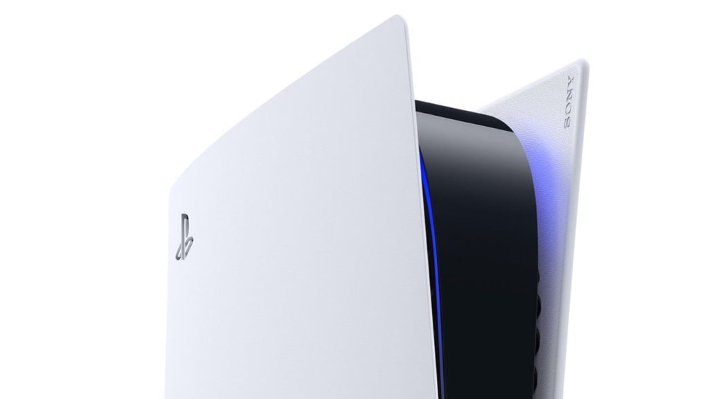
“It’s excellent. It looks futuristic as fxxx and it delivers on being 2020 technology. It looks like one of those fake consoles that you see which are in no way a bad thing because they always looked better than the real thing. It’s much better than the Microsoft’s server looking console.”
– Anonymous designer 1
“I’d be embarrassed to have this in my living room”
– Anonymous designer 2
“Design trends are irrelevant, functional design is ageless, it’s supported by the design community because it states what design is, intention and function over whacky form”
– Anonymous designer 3
- Finally, the life of the infamous two-wheeler Segway is over. It’s a perfect example that people wanted so badly to love ignoring how impractical it was. It was an innovative and funky way to get around, but it was also very meaningless. Because of that, Segways generally make perfect examples of why people need to employ user research and look for improvements around crucial pain points, instead of coming up with a solution and looking for the problem. Although this madly designed product had many hardcore fans that kept it alive for years. https://bit.ly/segwayisdead
- Talking about the software, Apple’s recent announcements in MacOSX and iOS14 UX and UI changes have divided designers as well. While most side with Apple by default as it has plenty of clout to influence the industry, some have highlighted that it’s unnecessary form over function exercise. What’s clear is that the flat design is slowly dying, which should make any UX designer happier. For example, the return of skeuomorphism, shadows, rich element cohorts and panels will enhance usability.
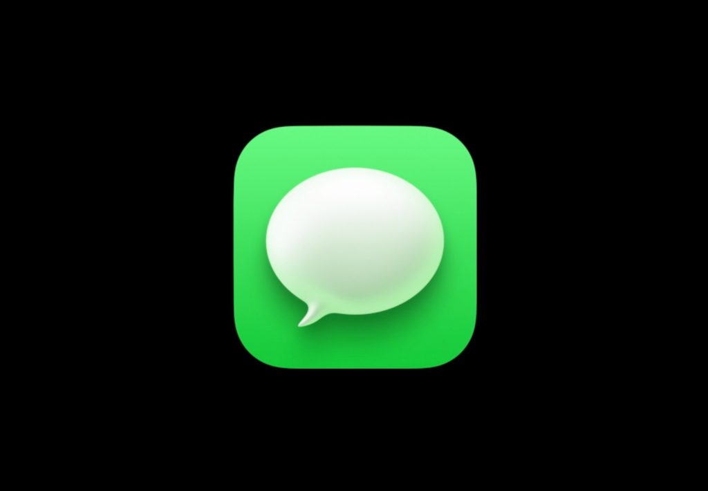
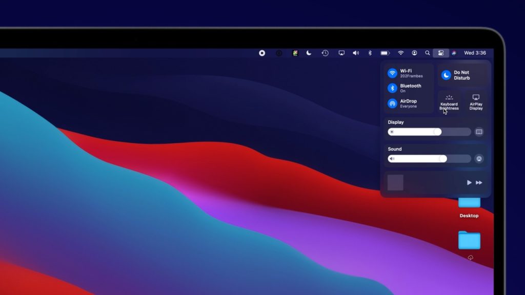
“Look at this beauty ?“
– Anonymous designer 1
“The new iOS update is the now-defunct Windows Phone, but with rounded corners. That was the best mobile UI.”
– Anonymous designer 2
“Nowadays you go for bland easy to use standardized solutions because if the user does not know what to do the moment he lands his eyes on it, he will go away..”
– Anonymous designer 3
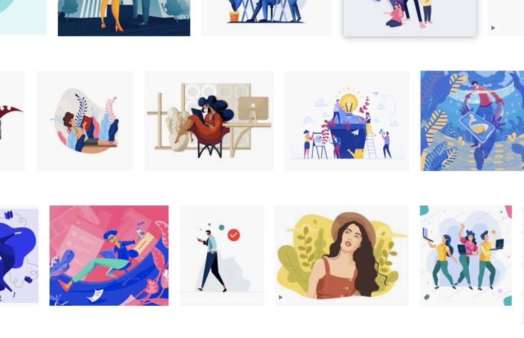
- I’ve mentioned this example previously but given the topic, it’s worth sharing again – the overtly popular flat illustrations make every quite bland. Some people love it, others hate it and call it soulless:
“I’m willing to say that the people ranting that harshly on the internet aren’t very skilled craftsmen anyway…”
– Anonymous designer 1
“I don’t like it because any lazy “designer” can do it. No need to study proportion or anything related to art.”
– Anonymous designer 2
“Why do companies that want to seem smart and reasonably progressive invariably use vector graphics in their twitter advertisements?”
– Anonymous designer 3
This article though showcases some of the work that on its own looks great, but given the list of repetitiveness makes it look like a new generation of generic stock photos. Perhaps then the trend (or fad) will pass that’s what’s going to become of flat illustrations? Also interested to hear your thoughts (hit reply).
https://bit.ly/flatpicsfad
- It’s worth going deeper into human factors. This month’s random interesting psychology study shows why people won’t change their minds, even if presented with tangible evidence. In short, people like you and me tend to attach their identity to things, messages, topics, political half-truths and so on. This is one of the reasons challenging ideas divides the audience so much. Taking the previously mentioned example of Apple’s new design patterns, it yet again sparked a long going debate of righteousness between Mac and Windows users. Mac users can’t help but become more loyal, Windows one’s hate the new stuff, even more, ad infinitum. Read more on the actual study here: https://bit.ly/nomindchanging
- You can’t find more designed division than in human vs machine arguments. I’m talking about the silent but important humane AI, human-centred machine learning solutions aka orienting the progress of technology into more meaningful and human goals oriented ways. As per examples above by default, technology divides as it gives us tools to pursue what we already know disregarding what we don’t know. But this is a perfect opportunity for us as designers to influence how technology progresses and what human needs are answered. If you have ever considered the long game in your design career, focusing human-centred AI development (HCAI) should be it. This article is an excellent introduction: https://bit.ly/humancentredai
- Let’s finish with this utopian (but readily available idea that solves division): shared reality, diverse opinions. As noted before different beliefs are human. And since the beliefs and views shape our surroundings, it’s almost impossible to have the same shared reality. In his short article on the issue Seth Godin describes it as: “It’s tempting to race right into our plans to solve a problem, but too often, we wrap our version of reality tightly into that proposed solution, without thoughtfully getting buy-in on the reality before launching into the solution we’re so eager to describe. Shared reality is the foundation on which we can build trust, make promises and engage in a useful discussion on how to achieve our goals.” And so shouldn’t this be our ultimate goal if we want to connect? https://bit.ly/sharedreality
Like what you see?
Get a monthly email with 7 design bullets. The things that kept me pondering over the last month that I think can benefit you. For example, you can expect a mix of:
- Design inspiration
- Emerging and disruptive tech
- Experience design ‘stuff’: UX, CX, service and product design how to’s, case studies and best practices
- Design ops, process improvements and better ways to work together
- Controversial topics and design challenging takes
- Random interesting psychology studies
- My UX resources I think would benefit you
+ a few concise thoughts on all of the above.
Ready to opt-in?
- Comes out once a month
- Absolutely free
- Spam-free
- Unsubscribe anytime
