In this latest UX portfolio review, I’ll cover an interesting case that explores solutions to prevent fatal accidents in endurance sports. This case study example is perfect on to illustrate the necessity for deeper user research and strategic design.
Transcript:
So we’ll have another portfolio to review and this time is by ux. From the Design squad discord community, make sure to join it if you want to connect it like-minded individuals, people who want to get into UX and generally get advice or, you know, share or like help each other out because that’s how you actually learn and it’s super important to stay connected as.
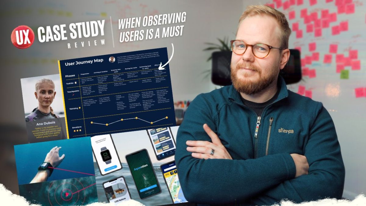
Especially in the field, which requires so much to enter, so it’s a no brainer. Do join. Anyhow, immediately there is one thing, and I’m gonna call out, which is atypical to my reviews, is that visual layer, which I don’t really touch much usually, but it feels like it was maybe a PowerPoint keynote presentation and when a lot of those slides were actually entered here and vex seems to be added on top of that.
Or vi text is a lot of mixed, different format bits. So this a small thing. Of course you could optimize it further. Another thing, what I immediately called out is to be very careful using the actual stock imagery or doing very sparingly. So if you want to illustrate something like companionship, let’s say you could add this photo of course, but make sure it’s not just there, like all across the board because there is a lot of information.
Add the content to illustrate the story or support the story, not the other way around. One thing I would be careful here is adding the lead next UX research, or maybe just say that you did UX research and you actually project led or project managed it. Or maybe you were product managing it, you know, you wore a bad hat.
Just say that as a discipline. Don’t put like seniority to it because it’s a bit of a dichotomous to say that it’s conceptual project in a school and when you had actually a lead, because a lead is an actual title in the industry. So just, you know, it’s a small bit, and I guess you simulated a client who’s a GPS maker, I presume, of software development for geolocations.
You kind of, I guess, ran some opportunity, discover to understand where you could use. And then you went into the very specific use case, prevent accidents for open water swimmers. It’s not too clear exactly how you did arrive at that from, you know, all the different opportunities. And why did you decide that way?
Would take you just one line to be very descriptive. Various lack of competition maybe, or things of that nature. You could kind of guide me a bit more for your decision. One concern which you highlight is drowning, third leading cause of accident deaths face in a worldwide immediately. It’s a bit concerning if it’s the right solution to me, and if perhaps you’re linking yourself too much to the methods or to the channels or to the technology.
So you did some surveying to use research it. You find out that we go unsupervised. Experienced swimmers can face anxiety and then also quote, which is powerful to use, is good to kind of showcase exactly what we mean by that, especially if you want to get that message across. But looking into deliver is almost like a very specific set of people who would use this or whatever solution you come.
As you know, evident on my risk, let’s say, of endurance sports. I tend to invest heavily in tech to support my things because I need that, but you need to consider who are those people maybe to reflect this better. Could have use, and maybe this is a tip for everyone else, like a persona grid, defining that you know, their tech aptitude, even income could drive it too, because not every runner or not every swimmer invest heavily in their.
With a journey map, something to call out. Of course. I like that you included it. I feel like it should be richer and grander and it should have more steps because it’s never that simple, especially in these cases. One thing, what I noticed is that you’re thinking touchpoints, emotions. Are not too reflective of the, let’s say, the safety, like again, those variables, what would they consider?
Is it their personal safety? Is that the other people are informed? Is it that I don’t know their goals are completed? Is it time maybe they’re spending in a water and that. You know that urgency is what makes them make poor decisions or something like that. So maybe it’s decision making too. Emotion could be replaced of fat.
Like you could literally say instead of satisfied, neutral, or unsatisfied. It could be like feeling of safety, hitting deep into the psychology in the human needs. You did some competitive analysis. I liked what you looked at the hardware, because what played in my mind as I was introing into this case study was like, Why would you even go for a watch or a smartphone?
Of course, it’s readily available, but you could also consider introducing a device and you considered exactly what the features are like. And of course, every single thing has differently, jumped immediately into ideas. Ah, like you could it a bit farther. Instead of saying, how might we reduce drowning with a phone or the smart watch, you could ask how might we improve the actual user experience?
But two are very different. One is solution driven, one is user driven. You need to pick which one. Like if it’s ux, you kind of need to start with what do the users need? And it could be that your GP. And everything else you had in mind, like, you know, using smartphone and things like that is not gonna stick anymore.
But you should be fine with that. You could challenge the business, the stakeholder of it, and say, Hey, your solution should look slightly different, but your ideation should come of how might we improve the actual user safety? The user experience, How might we indicate to them that these service save zones?
Of course, you could default back into the smartphone and represent it there, but you need to think a bit more holistically before you just jump into it and just, you know, churn these mockups or things of that nature and looking the actual features. You covered a lot of that. The only thing, what I think what you restricted to yourself again is the, But you’re gonna stick with it and nothing else is gonna matter.
And I’m gonna give you a small example, but it’s, it’s sort of related that then my wife is running somewhere in, let’s say, Woods or Parks. She likes to go on WhatsApp and share her location live. For like at least an hour. She preventatively turns it on and then I can on WhatsApp just say, Okay, how far is she from home?
Let’s say to do lunch, or something along those lines. I can check it on my WhatsApp app and I can check exactly where she is. That’s one of the features which combines. Two apps on two different phones, one single product. It could be multiple different products like that. It could be smartwatch, it could be, but this kind of tells you the holistically how you could do that.
It doesn’t have to be just you and SOS service. If you are reflected holistically and you understand how people do this, your solutions are gonna be much more meaningful to them. You tested it on Figma while you didn’t test it in a wild, so Ethnography. One thing which you could do that would make your solution much more sound as well.
And kind of going back to your user research, which I didn’t point out and kind of like now it came a bit too late to me as well, is like you probably would want to shadow an actual swimmer and go through their journey end to end. Literally ask, Can I be next to you on a boat? Or can I like, you know, go for a swim with you and see exactly what you do.
To what extent, you know, what do you consider? Can I talk to and interview them at that point? And in the same way, you should also test it in a natural environment as they do their actual tasks and activities. And I’m not gonna go too much into the actual UI of it because the thing with underlying UX is much more important.
To make this a success. I like the look and feel of it. I like the concepts and things of that nature where sound is what I’m questioning is really like that. Like how does that connect? Does it actually have a strong legs to succeed? You refine the designs, made changes. That’s great. Great, great, great. As we said, the stock photos here, I think cheapen your statements and your visuals and things of that nature.
You could simplify. And in the next steps, you’re saying many open water swimmers, you swim, boy. So this would be a great idea. Even putting gps, these things show holistic thinking, but you could start half started in the ideation of fat or user research of fat. And at points you’re not gonna be flexible and have ability to challenge your stakeholders who might have wild ideas or be attached to their ideas.
But as you. You’re gonna need to think bigger and bigger and bigger. And then see exactly what makes sense, what doesn’t make sense, and almost like go with that and maybe ignore the rest. If you like this video, smash that like button. Leave a comment down below what you think about it. And on that note, I’ll see you next time.